

The visibility hierarchy: Why users can’t find what you wrote
The 4 visibility tiers every content designer should know

You wrote a perfect tooltip. Clear, concise, exactly what users need to complete the task. You’re proud of it. You move on to the next project.
Three months later, a support ticket lands in the shared Slack channel:
“I’ve been trying to figure out what format to use for the date field. Is it MM/DD or DD/MM? I’ve clicked everywhere and can’t find any instructions.”
You check the screen. The instructions are right there—behind a tiny (?) icon that users have to hover over to reveal.
You watch the session recording. The user’s cursor never goes near the icon. They try three different formats, get an error, try two more, give up, and contact support.
Your tooltip was perfect. Nobody saw it.
This isn’t a writing problem. It’s a visibility problem. And it’s one of the most common reasons good content fails to help users.
Why content designers need to think about visibility
Every piece of copy has a visibility cost—the effort required for a user to discover and read it. When we don’t account for this, we end up with:
Critical instructions buried in tooltips nobody opens
Explanatory copy hidden behind accordions users don’t expand
Legal disclaimers more prominent than helpful guidance
Microcopy competing with itself for attention
Nielsen Norman research suggests users read about 20% of page content. That means 80% of what you write is functionally invisible to most users on any given visit. Where your content lives determines whether it falls in that lucky 20%.
Here’s the uncomfortable truth: we’re often handed placements, not choices. Design says “put the helper text here.” PM says “add a tooltip.” But we should be asking a different question entirely.
Not “what should this say?” but “will anyone actually see it?”
The visibility hierarchy
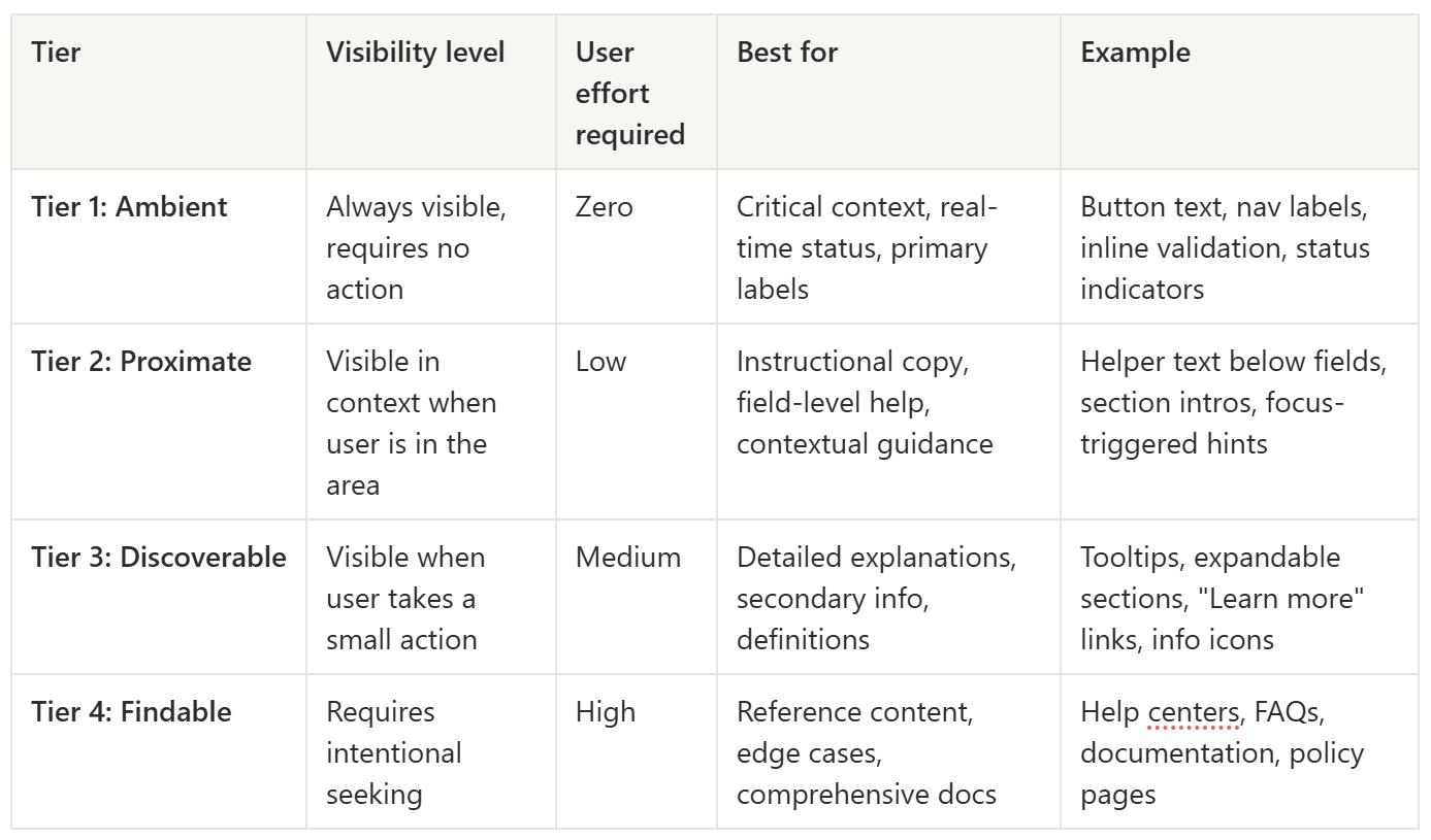
The tiers aren’t about importance—they’re about how hard users have to work to encounter the content. A Tier 4 placement doesn’t mean the content is unimportant. It means users have to go looking for it.
The mistake is treating all content as equally discoverable and letting UI constraints dictate placement. That date format instruction? It’s Tier 2 information stuffed into a Tier 3 container. No wonder nobody found it.
What belongs in each tier
Tier 1: Ambient visibility
Content that’s present without any user action. Navigation labels, primary headings, button text, status indicators, inline validation messages.
When to use: Information essential for the current task that users need without having to look for it.
Everything in Tier 1 competes for the same limited attention. Put too much here and nothing stands out. It’s like highlighting every sentence in a textbook—congratulations, you’ve highlighted nothing.
Tier 2: Proximate visibility
Content that appears when the user is in the relevant context—focus states, persistent helper text below fields, section introductions.
When to use: Guidance users need exactly when they’re doing the related task.
This is the tier most content designers underuse. It’s the sweet spot: visible when relevant, not cluttering the screen otherwise.
Tier 3: Discoverable visibility
Content behind a lightweight interaction—tooltips, expandable sections, “Learn more” links, info icons.
When to use: Supplementary detail that helps some users but would overwhelm others.
The key word is “supplementary.” If users can complete the task without this information, Tier 3 is appropriate. If they can’t, you’ve buried essential content behind a click most people won’t make.
Tier 4: Findable visibility
Content that requires navigation to reach—help centres, FAQs, documentation, policy pages.
When to use: Reference material, comprehensive guides, legal content, edge-case troubleshooting.
Tier 4 content serves users who already know they need help and are willing to go find it. That’s a small subset of your users. Don’t put anything here that the majority needs to succeed.
The visibility-importance mismatch
The most common mistake I see: treating all content as equally important and letting design constraints dictate placement.
Designer: “There’s no room for helper text. Can you put it in a tooltip?”
You: “Sure.”
What you should say: “This is Tier 2 information. A tooltip is Tier 3 placement. Can we find room for persistent helper text, or should we flag this as a usability risk?”
Sometimes the answer is still “put it in a tooltip.” But at least you’ve named the trade-off.
A quick decision framework:
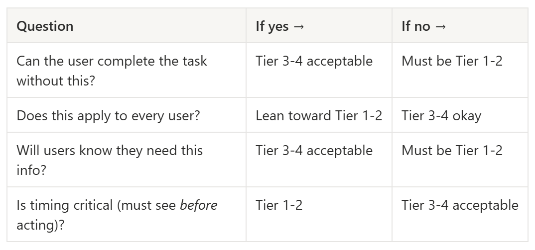
Real example: Password requirements
Tier 4 approach (bad): Requirements buried in Help Centre FAQ. Users discover them after three failed attempts and a rage-quit.
Tier 3 approach (risky): Requirements in tooltip on (?) icon. Some users find it; most don’t.
Tier 2 approach (better): Requirements visible when field is focused. Users see them exactly when they need them.
Tier 1 approach (usually overkill): Requirements permanently visible on page. Works, but adds visual noise for returning users who already know their password.
Most products need Tier 2 here. The information is essential (users can’t complete the task without it), timing-critical (must see before creating password), and universal (applies to everyone). That’s a Tier 2 profile.
And yet, I’d estimate 60% of password fields I encounter use Tier 3 or Tier 4 placement. Then product teams wonder why password creation has a high error rate. It’s not the copy. It’s the visibility.
Negotiating visibility with your team
Sometimes design constraints are real. There genuinely isn’t room. The visual hierarchy doesn’t support another text element. The page is already cluttered.
Here’s how to have that conversation productively:
Name the mismatch. “This info is Tier 2 importance, but we’re giving it Tier 3 treatment. I want to flag that as a potential usability issue.”
Quantify if you can. “Based on similar patterns, I’d estimate X% of users will miss this and either fail the task or contact support.”
Propose alternatives. “Could we use inline text instead of a tooltip? A persistent hint below the field? Progressive disclosure that defaults to expanded?”
Document the decision. If the team decides to accept the risk, that’s their call. But make sure it’s a conscious decision, not an accident.
You won’t win every negotiation. But you’ll win more than you expect once you start framing visibility as a usability variable rather than a design preference.
Auditing your content’s visibility
When I suspect visibility problems in a flow, I run a simple audit.
Step 1: List all content in the flow. Labels, helper text, tooltips, error messages, section headings, button text—everything.
Step 2: Categorize by current tier. Where does each piece actually live right now?
Step 3: Rate importance. 0 = nice-to-have, 1 = helpful, 2 = important, 3 = essential for task completion.
Step 4: Flag mismatches. High importance + low visibility = problem. Low importance + high visibility = noise.
Quick wins usually hiding in visibility audits:
Tooltips containing essential info → promote to inline text
Always-visible text nobody needs → demote to tooltip or remove entirely
Redundant help content → consolidate to single location
“Learn more” links leading nowhere useful → either create the destination or remove the tease
The audit takes maybe 30 minutes for a typical flow. The findings often justify hours of design discussion.
Connecting visibility to goals
Last time, we talked about the goal-task gap—how users think in goals while navigation speaks in tasks. Visibility is the other half of that equation.
Goal-aligned language in the wrong visibility tier still fails. Task-level copy in the right visibility tier at least gets seen.
The ideal: goal-oriented language at Tier 1-2 visibility for your most critical user journeys. That’s the content design sweet spot.
Try this: Map visibility tiers in a form
Take a form you’ve worked on recently—signup, checkout, settings, whatever’s handy.
List each piece of content and map it to its current visibility tier. Then assess whether the tier matches the content’s importance.
Example: A signup form
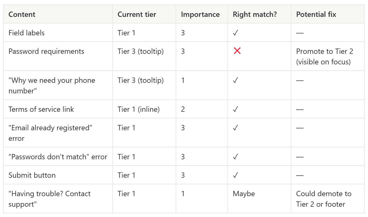
Notice how most of this form is fine. The one mismatch—password requirements in a tooltip—is probably responsible for a disproportionate share of user errors. One visibility fix could meaningfully improve the entire flow.
That’s the power of thinking in tiers. You stop asking “is the copy clear?” and start asking “will anyone see it?”
Related reading
User goals vs. user tasks: What your content says matters as much as where it lives—start here if you haven’t read it.
The Three Audiences Framework: Different audiences may need different visibility treatments for the same information.
Keep learning
If you’ve been following along, you now have frameworks for decision-making, audience awareness, error prevention, goal-task alignment, and visibility. That’s a solid toolkit for any content design challenge.
Subscribe to UX Writing Bud to get the next one in your inbox.