

User goals vs. user tasks: Why your navigation is confusing
Writing navigation that matches how users think

You’re observing a usability session. The participant—a 40-something project manager, clearly comfortable with software—needs to set up automatic payments for her team’s subscriptions.
She hovers over Billing. Clicks. Scans. Clicks back.
Hovers over Settings. Clicks. Scrolls. Nothing.
“I’m looking for... like, recurring payments? Autopay?”
The moderator asks where she’d expect to find that.
“Something like ‘set it and forget it’? Or just ‘automatic payments’?”
It lives under Payment methods → Scheduled transactions → Create new schedule.
She would never have found it. The system speaks in nouns and procedures. She’s thinking in outcomes.
This is the goal-task gap—and it’s one of the most common reasons users can’t find things in your product, even when those things technically exist.
Why we default to task-based thinking
Most products are built by engineers and product managers who think in system terms. The database has a transactions table, so the nav says Transactions. The API endpoint is called scheduledPayments, so somewhere in the UI, that language leaks through.
Alan Cooper calls this the implementation model—organizing around how the system works rather than how users think. It’s not malicious. It’s just the path of least resistance when the people building the product are deeply familiar with its architecture.
The problem is that users don’t share that familiarity. They come to your product with a goal in mind, not a mental map of your database schema.
The goal-task hierarchy
The same user need (”I don’t want to worry about paying rent”) gets expressed at four levels. Most navigation lives at the bottom two levels (Task and Action), while users are thinking at the top two levels (Life goal and End goal).
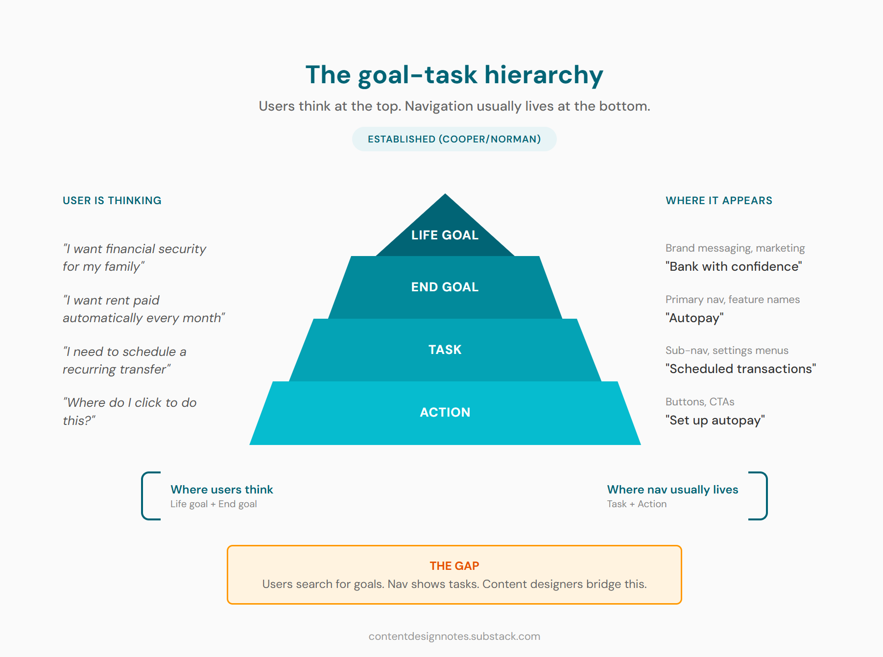
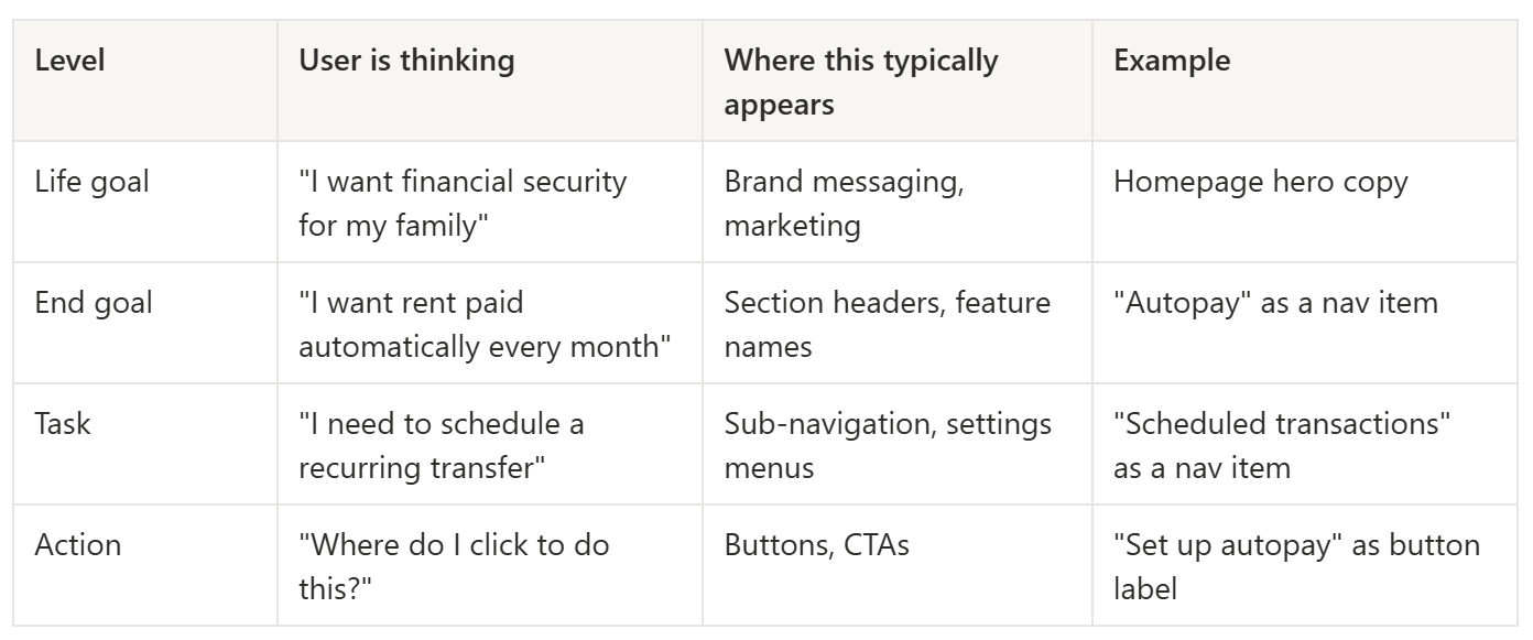
Most apps put users at “Scheduled transactions” and expect them to figure out this is where autopay lives. Goal-oriented navigation would surface “Autopay” at a higher level so users don’t have to translate.
Where content designers have leverage
We typically write at the task and action levels—button labels, instructional copy, field descriptions. But our labels, headings, and wayfinding copy can either bridge to the goal level or widen the gap.
Compare these:
❌ Transfer funds
✔️ Send/receive money

❌ Configure notification preferences
✔️ Manage alerts

❌ Set up automatic payments
✔️ Autopay
The task-level versions are accurate. They describe what the system does. But the goal-level versions connect to why users care. One sounds like a software manual. The other sounds like a promise.
This doesn’t mean every label should be goal-language. Sometimes task-language is exactly right:
When task-based framing works well:
Expert or power users who’ve internalized the system model (refer to the Three Audiences Framework)
Highly procedural contexts like admin dashboards or developer tools
When the task name genuinely IS the goal (rarer than you’d think)
Secondary navigation where users have already oriented themselves
New users typically need goal-level language. Power users often prefer task-level precision. The challenge is serving both—usually through progressive disclosure, where primary navigation uses goal-language and secondary levels get more specific.
Power users will forgive you for being clear. Confused users will not forgive you for being precise.

Diagnosing goal-task misalignment
You don’t always have the luxury of watching usability sessions. But there are other signals that your product has a goal-task mismatch.
Red flags to watch for:
Search queries don’t match nav labels. (This is my go-to method too) If users search for cancel subscription but your nav says Manage plan, you have a vocabulary gap. Search logs are one of the most underused diagnostic tools for content problems.
Support tickets about “where do I find...” When users contact support to locate something that exists, the problem usually isn’t missing content—it’s misaligned language. The thing is there. It’s just not named what users expect.
High bounce on landing pages. Users arrive, scan for their goal, don’t see it reflected in your headings or nav, and leave.
“I clicked X expecting Y” feedback. This is the clearest signal of mental model mismatch. Users thought a label meant one thing; it meant another.
The quick diagnostic:
If you can get five minutes with actual users—or even colleagues who aren’t on the product team—ask them: “What are you trying to accomplish?” Not “what are you looking for?” The first question surfaces goals. The second often just echoes your existing labels back at you.
If their answers cluster around concepts your navigation doesn’t surface, you’ve found your gap.
Reframing content around goals
When you’ve identified misalignment, here are practical techniques for closing the gap:
Label navigation with outcome language where possible
Not every nav item can be goal-phrased, but more can than you’d think.
❌ Account settings
✔️ Manage your account

❌ Notification preferences
✔️ Manage alerts

❌ Security
✔️ Keep your account safe
The goal versions are slightly longer. That’s usually an acceptable trade-off for clarity. If your character count is so tight that three extra words break the layout, you may have bigger problems.
Write headings that answer “why am I here?”
Page headings are prime real estate for goal-language. Users scan headings to confirm they’re in the right place.
❌ Transfer settings
✔️ Control how your money moves

❌ Subscription management
✔️ Your plan and billing
Use progressive disclosure to bridge levels
Primary nav: goal-level (Send money)
Secondary nav or tabs: task-level (To a person, To a bank account, Internationally)
In-page sections: action-level (the actual form fields and buttons)
This lets users orient at the goal level, then drill into specifics.
Add contextual wayfinding for confused users
Sometimes a small bit of copy can bridge the gap without restructuring anything:
“Looking to send money to a friend? You’re in the right place.”
“This is where you’ll manage recurring payments.”
These feel redundant to people who already understand the system. They’re lifelines for people who don’t. Think of them as little “you are here” signs for the navigationally lost.
What content can’t fix
I want to be honest about the limits here. If the information architecture itself is fundamentally task-organized—if the entire structure assumes users think in system terms—copy can only do so much.
You can relabel a nav item. You can add contextual wayfinding. You can write goal-oriented headings. But if the underlying structure requires users to know that Flex Return means one-way rental, or that Scheduled transactions means autopay, you’re patching symptoms.
Know when you’re solving a content problem versus when you need to escalate to a product or IA conversation. The diagnostic work above gives you evidence for that conversation. Whether anyone listens is, of course, a separate problem entirely.
The bridge to conversational design
If you work on chatbots, voice interfaces, or any conversational UI, this goal-task distinction becomes even more critical. In those contexts, it’s called intent mapping—understanding that a user saying “I need to pay my rent” has a goal, not a feature request.
The same hierarchy applies: you map user utterances to intents (goals), which trigger conversation flows (tasks), which execute actions. We’ll dig into intent mapping in the coming posts, but the foundation is the same principle you’re learning now.
Users speak in goals. Systems respond in tasks. Your job is to translate.
Try this: Audit a product’s navigation
Pick an app you use regularly—something you know well enough to navigate without thinking.
List five things you do in the app. For each one, write down:
What the nav calls it (the label you’d click)
What you’d search for if you couldn’t find it (your goal-language)
Example: Spotify
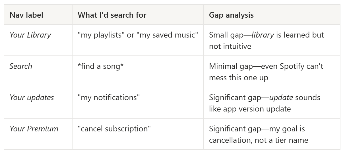
Notice how even a well-designed product has gaps. The question isn’t whether gaps exist—it’s whether they’re in places that matter for core user journeys.
Related reading
The Three Audiences Framework: Different audiences need different levels of goal vs. task language—this helps you decide who you’re optimizing for.
The If-Then-Else Framework: Decision logic for choosing when goal-level framing serves users vs. when task-level precision is better.
Keep learning
If this framework helped you see your product’s navigation differently, you might like what’s coming next. I publish every other Friday—foundational UX writing frameworks alternating with AI and conversational design topics.
Subscribe to UX Writing Bud to get the next one in your inbox.